VietJet Air
The Vietjet Air mobile app was redesigned to simplify finding low-cost tickets and increase in-flight service purchases. Achieved 30% fewer navigation errors, improved class comparison for 80% of users, and cut ticket search time by 33%.
The Vietjet Air mobile app was redesigned to simplify finding low-cost tickets and increase in-flight service purchases. Achieved 30% fewer navigation errors, improved class comparison for 80% of users, and cut ticket search time by 33%.


TLDR
Redesigned Vietjet Air's mobile app to increase the uptake of additional services. Conducted user interviews, wireframing, prototyping, and UX/UI design.
Key improvements include simplifying the cheapest flight screen and improving the comparison of booking classes. Addressed pain points such as hidden fees and complex navigation to enhance the overall user experience and boost business revenue.
33%
33%
33%
faster ticket search
faster ticket search
faster ticket search
30%
30%
30%
fewer navigation errors
fewer navigation errors
fewer navigation errors
80%
80%
80%
of users finding it easier to compare benefits
of users finding it easier to compare benefits
of users finding it easier to compare benefits
My Role
User interview
User interview
User interview
UX design
UX design
UX design
Wireframe
Wireframe
Wireframe
UI design
UI design
UI design
Aims and Requirement
Our design team is leveraging enhancements in our website and app interfaces to boost revenue through add-on flight services and maintain competitive ticket pricing.
The challenge extends to our application's hidden fees, as it's unclear how much revenue these contribute. I strategised how to present fees to customers, enhancing trust without sacrificing the company's financial goals.
Our design team is leveraging enhancements in our website and app interfaces to boost revenue through add-on flight services and maintain competitive ticket pricing.
The challenge extends to our application's hidden fees, as it's unclear how much revenue these contribute. I am able to strategise how to present fees to customers, enhancing trust without sacrificing our financial goals.
For users
Enhance the speed of locating affordable tickets for users.
For users
Enhance the speed of locating affordable tickets for users.
For business
Increase the uptake of additional services while ensuring a positive user experience.
How might we make users to understand that the airline ticket prices are increasing gradually step by step while still feeling comfortable with it?
For business
Increase the uptake of additional services while ensuring a positive user experience.
How might we make users to understand that the airline ticket prices are increasing gradually step by step while still feeling comfortable with it?
Identifying Problems
Before starting the project, I wanted to evaluate the app’s current design. Given the project's scope, I conducted a Heuristic Analysis, which enabled me to quickly and inexpensively identify potential usability issues early in the design process.
During this exercise, I initially understood which issues should be prioritised.

Before I could focus on identifying specific user issues during their journey with Vietjet Air, I first need to understand their journey they take through the app
I produced usability testing with the current design which helped with:
Verifying all the issues that I found in Heuristic Analysis
What is influencing motivation and ability to purchase additional services
Understanding about the users behaviour and preference
I further defined the problem we were trying to solve and aimed to gather as much insight into customer needs, business needs, and technical and design needs. After collating a satisfactory amount of customer data and feedback, these insights helped us understand the breadth and depth of the problem and uncover the 'How' behind the problem.
I further defined the problem we were trying to solve and aimed to gather as much insight into customer needs, business needs, and technical and design needs. After collating a satisfactory amount of customer data and feedback, these insights helped us understand the breadth and depth of the problem and uncover the 'How' behind the problem.

The Problems
“Dark pattern” = Higher drop - off rate
Efficiency
Users found the cheap ticket search screen confusing and frequently skipped it, perceiving it as a waste of their time.
Efficiency
Users found the cheap ticket search screen confusing and frequently skipped it, perceiving it as a waste of their time.
Organisation
The flight list display was unclear, with hidden buttons that left users uncertain about where to click to proceed
Organisation
The flight list display was unclear, with hidden buttons that left users uncertain about where to click to proceed
Dark Pattern
Surprised by the sudden increase in ticket prices without understanding the reason. Unaware of the automatically selected services, leading to a feeling of being deceived.
Dark Pattern
Surprised by the sudden increase in ticket prices without understanding the reason. Unaware of the automatically selected services, leading to a feeling of being deceived.

Old design
Old design
Old design
Old design
8/10
people interviewed don't understand why ticket prices have increased so much. When they realise that the price hike is due to the initial cost not including taxes and fees, they feel deceived.
people interviewed don't understand why ticket prices have increased so much. When they realise that the price hike is due to the initial cost not including taxes and fees, they feel deceived.
Everyone
interviewed feels very annoyed when they find out that the additional flight services are automatically selected.
interviewed feels very annoyed when they find out that the additional flight services are automatically selected.
7/10
people interviewed find it difficult to use the feature for finding cheap ticket.
people interviewed find it difficult to use the feature for finding cheap ticket.
New Design
Uptake Additional Service
New User Flow
Based on the findings from usability testing, I revised the user flow of the old version.
Based on the findings from usability testing, I revised the user flow of the old version.

Old user flow
Old user flow
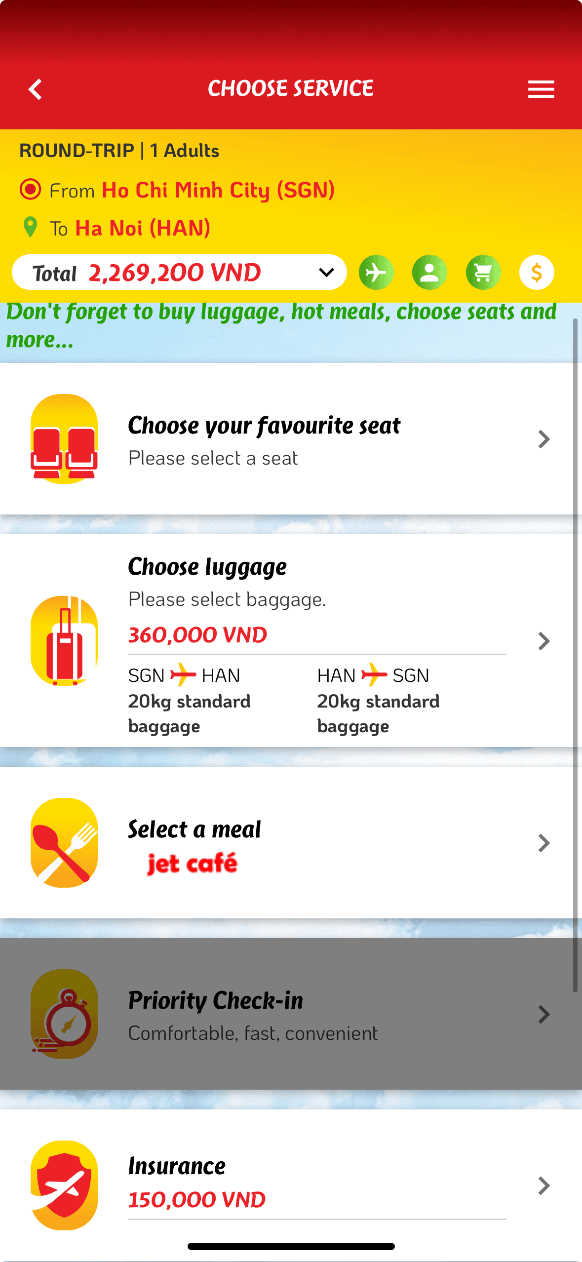
Previously, users could select each service before proceeding to the next step, but they often skipped all services and went straight to payment, which hindered our ability to upsell additional services. To address this, I separated the service selection into individual steps, encouraging users to go through and select services more comfortably and effectively.
Previously, users could select each service before proceeding to the next step, but they often skipped all services and went straight to payment, which hindered our ability to upsell additional services. To address this, we separated the service selection into individual steps, encouraging users to go through and select services more comfortably and effectively.

New user flow
New user flow
Tailored Prompts
I integrated images and more user-friendly language to encourage users to purchase additional services. For example, it automatically selected a seat based on weather conditions, offered tips for saving on online services, and highlighted popular services favored by others.
This approach used the Fogg Behavior Model and social proof to guide user decisions effectively.

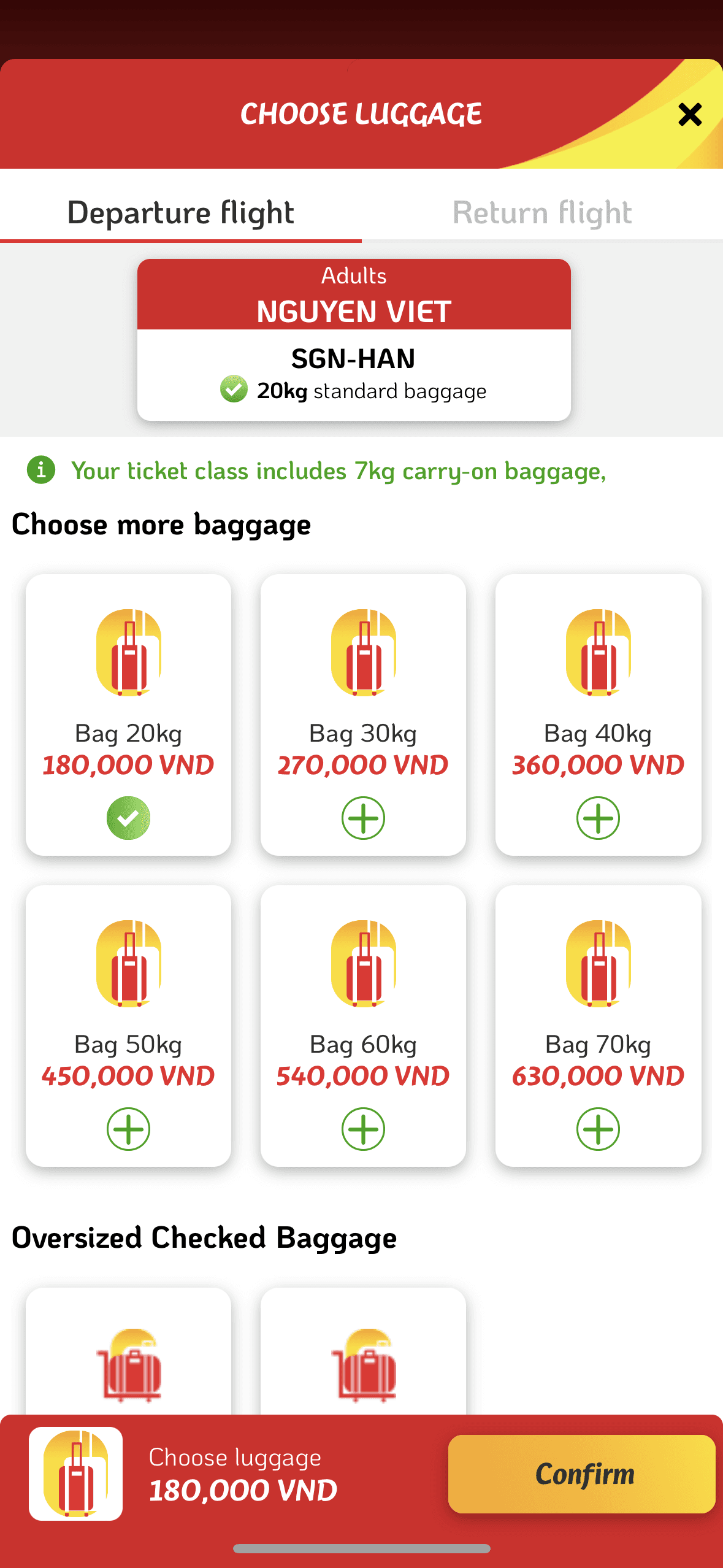
New design
New design

New design
New design

New design
New design
Streamlining Services Comparison
The old interface overwhelmed users with information when selecting ticket classes, so I redesigned the interface to facilitate easier comparison between ticket classes.
Additionally, I highlighted the cost benefits of purchasing tickets online compared to at the airport, encouraging users to buy online.

Old design
Old design

New design
New design
Old design
Old design

New design
New design
Transparent Fare
The old design included many hidden fees, raising the question: should we display all these fees? Since I was unsure how much profit these 'hidden fees' generated for the business, the problem became more complex.
The key issue was: how can we help users understand that airline ticket prices increase gradually step by step while still ensuring they feel comfortable with it?

Old design
Old design

New design
New design

New design
New design

New design
New design
The price + fees to notify users that this is not the final ticket price yet. Reduce the feeling of surprise when the final ticket price becomes too high, causing users to feel deceived in the old version
The price + fees to notify users that this is not the final ticket price yet. Reduce the feeling of surprise when the final ticket price becomes too high, causing users to feel deceived in the old version
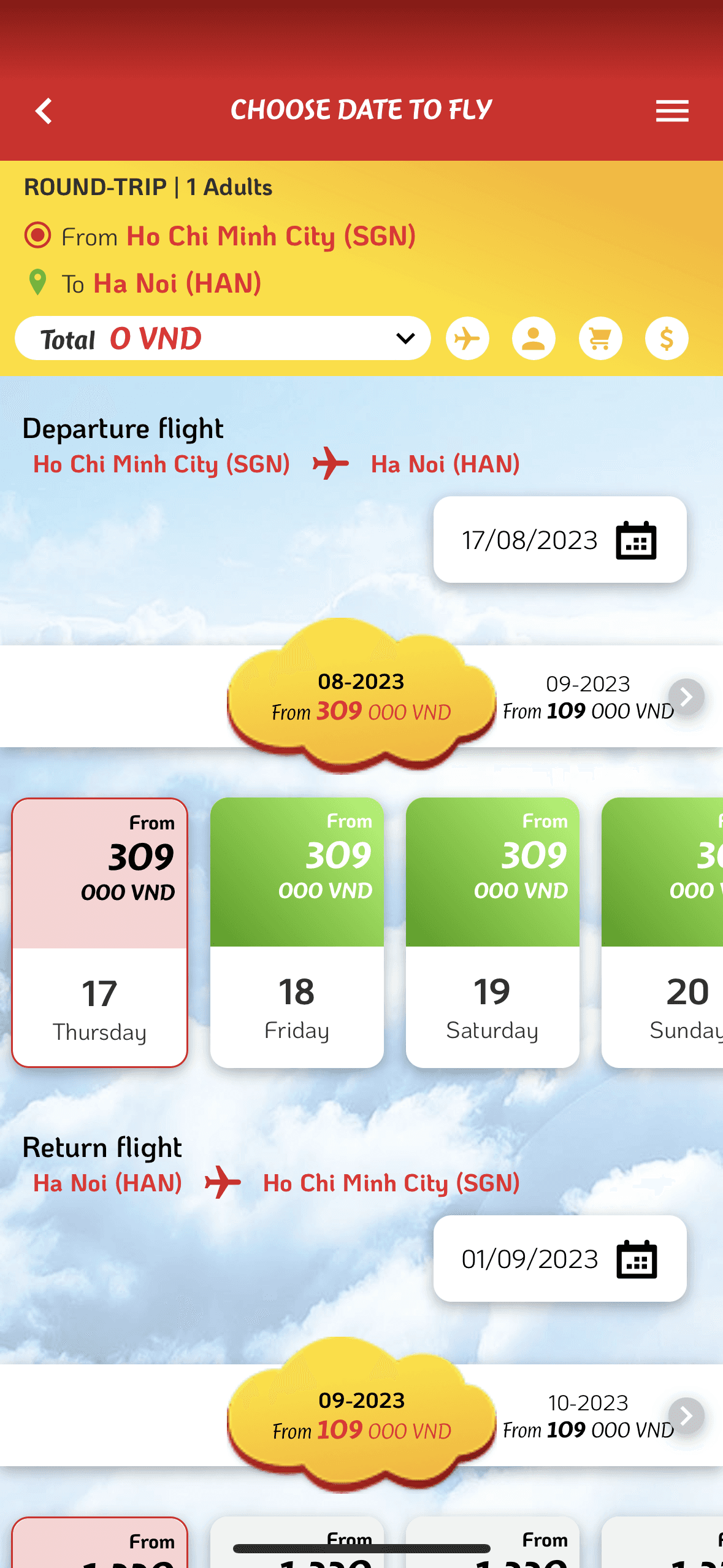
Easily Find Cheap Flight Tickets
Calendar
The calendar now highlights the days with the cheapest prices, replacing the separate "Cheapest Price" feature, which could distract users. Instead, it is integrated as a subtle feature within the core functionality.
The calendar now highlights the days with the cheapest prices, replacing the separate "Cheapest Price" feature, which could distract users. Instead, it is integrated as a subtle feature within the core functionality.

New design
New design
New design
New design
Old design
Old design
Suggestion
The system now automatically compares the ticket price on the user-selected date with the average ticket price, offering suggestions on the best time to make a purchase.
The old design lacked clear navigation, leading most users to misunderstand the purpose of this screen.
The system now automatically compares the ticket price on the user-selected date with the average ticket price, offering suggestions on the best time to make a purchase.
The old design lacked clear navigation, leading most users to misunderstand the purpose of this screen.
Old design
Old design
New design
New design

New design
New design
Conclusion
Conclusion
Take Away
Take Away
Design solutions involve tradeoffs as the interests of the business and the needs of the users may conflict. The key for designers is to find a "sweet spot" where both requirements are balanced.
I found great value in seeking feedback and advice during this project. Engaging with experienced designers and stakeholders allowed me to break free from conventional thinking and approach challenges from different angles. In the future, I will continue to seek help when I encounter obstacles and offer my assistance to others when they need advice.
Next Step
Next Step
Specify the essential metrics for assessing the new design's effectiveness. Additionally, broaden the research scope to encompass other user profiles in order to investigate more comprehensive solutions
Specify the essential metrics for assessing the new design's effectiveness. Additionally, broaden the research scope to encompass other user profiles in order to investigate more comprehensive solutions
Don't miss out
Don't miss out