Saturday
Saturday
Redesigned Saturday app for easier friend categorization. Revamped Home and Profile screens, created Figma design guidelines, and reworked 30+ components. Collaborated with Capi Product team to enhance app connectivity.
Redesigned Saturday app for easier friend categorization. Revamped Home and Profile screens, created Figma design guidelines, and reworked 30+ components. Collaborated with Capi Product team to enhance app connectivity.

TLDR
TLDR
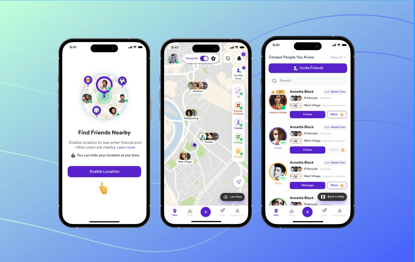
Saturday is a project in which I participated while working with Capi Product. Saturday is a location-sharing application that facilitates making new connections and reconnecting with folks with whom you've lost contact.
Saturday is a project in which I participated while working with Capi Product. Saturday is a location-sharing application that facilitates making new connections and reconnecting with folks with whom you've lost contact.
Redesign the Home screen and Profile screen.
Redesign the Home screen and Profile screen.
Client-facing: Creating, building, and maintaining good working relationships with clients
Client-facing: Creating, building, and maintaining good working relationships with clients
Design guidelines were created in Figma from scratch. Reworked and coordinated over 30 components and their variants
Design guidelines were created in Figma from scratch. Reworked and coordinated over 30 components and their variants
Design guidelines were created in Figma from scratch. Reworked and coordinated over 30 components and their variants
The problems
The problems
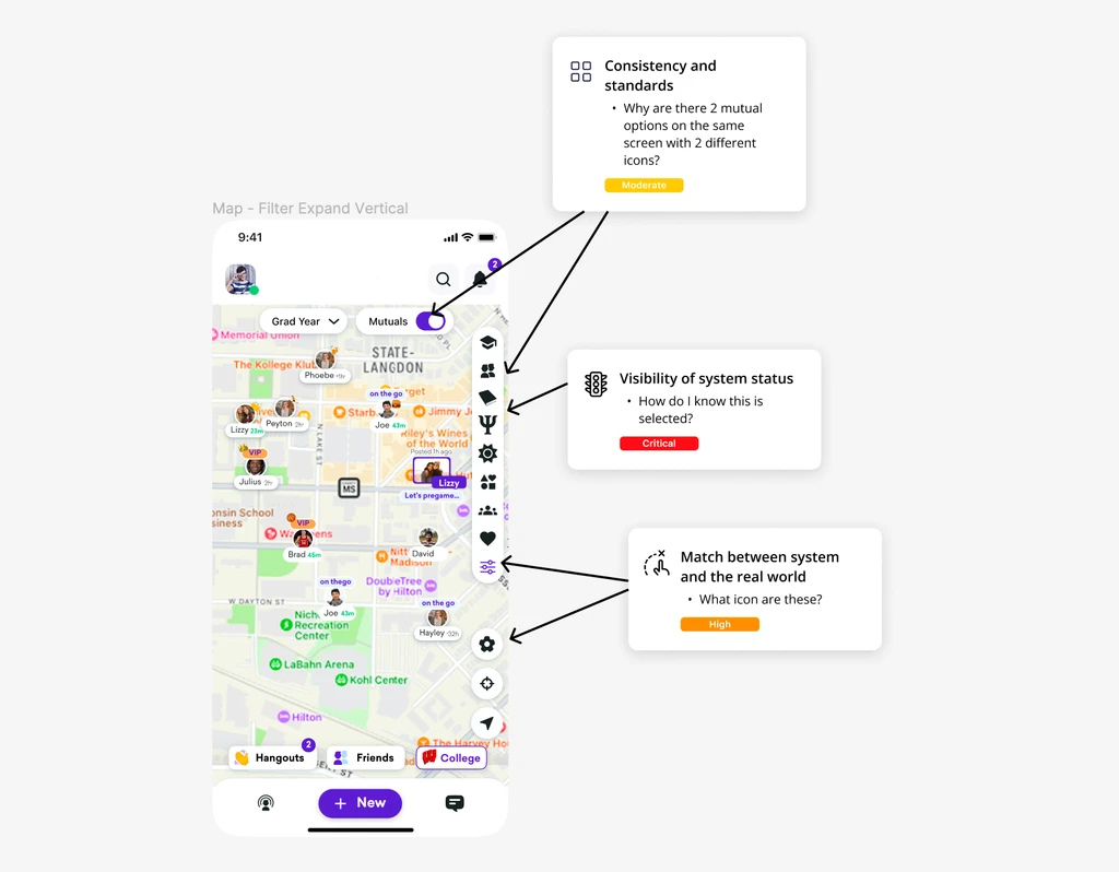
Confusing Icons and Overloaded Sorting Bar Causing User Overwhelm
Confusing Icons and Overloaded Sorting Bar Causing User Overwhelm
The sorting bar in Saturday's previous design had many options. Using uncommon icons in the plan could confuse and overwhelm users, especially when interacting with the app. The abundance of information increases the cognitive load for users, making them more likely to feel overwhelmed and give up quickly.
The sorting bar in Saturday's previous design had many options. Using uncommon icons in the plan could confuse and overwhelm users, especially when interacting with the app. The abundance of information increases the cognitive load for users, making them more likely to feel overwhelmed and give up quickly.
Old design
Old design
Identifying Problems
Identifying Problems
Before starting the project, I wanted to evaluate the app’s current design. Given the project's scope, I conducted a Heuristic Analysis, which enabled me to quickly and inexpensively identify potential usability issues early in the design process.
During this exercise, I initially understood which issues should be prioritised.
Based on Jacob Nielsen’s 10 heuristic principles, I conducted a heuristic analysis to define the usability problems in the user interface design. The severity ratings used in this evaluation were as follows:
Based on Jacob Nielsen’s 10 heuristic principles, I conducted a heuristic analysis to define the usability problems in the user interface design. The severity ratings used in this evaluation were as follows:

Core Experience
Core Experience
Reduce Cognitive
Reduce Cognitive
To improve user experience, I reduced the number of questions per screen by splitting information and limiting selections to five, following Miller's Law. Utilizing the chunking method, I grouped options into five clusters. Each group is color-coded, allowing users to easily identify which group a person belongs to on the map. The corresponding pop-up below then provides more detailed information based on the selected group.
To improve user experience, I reduced the number of questions per screen by splitting information and limiting selections to five, following Miller's Law. Utilizing the chunking method, I grouped options into five clusters. Each group is color-coded, allowing users to easily identify which group a person belongs to on the map. The corresponding pop-up below then provides more detailed information based on the selected group.
Map view
Map view

Old design
Old design

New design
New design

New design
New design
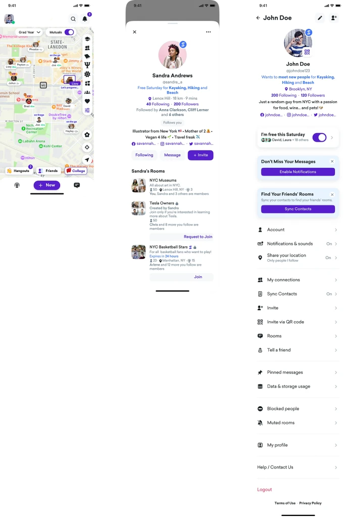
Profile

Old design
Old design
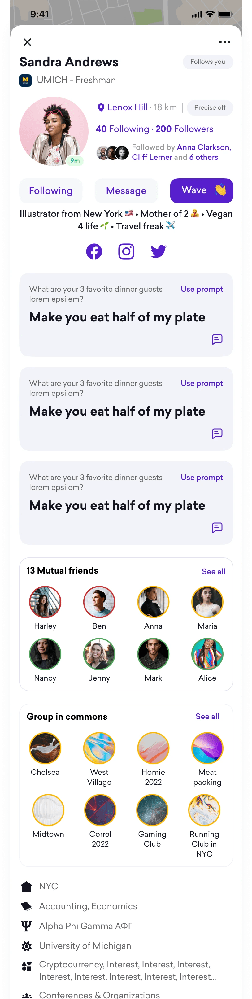
New design
New design
Conclusion
Conclusion
Take Away
Take Away
For this project, I had the chance to work with beginners, which helped me talk through decision options and explain my method in order not just to get their opinions but also to prevent my own biases. I gained communication skills by doing this. People can only assume what you're thinking if you don't speak. In the early stages, communication will assist the team in staying on the same page and reduce any potential personal biases.
The best design happens in the open. Design improves when others offer their perspectives and learn from your work. It's a two-way street, and design should be seen not only by the design studio but also by other teams and clients.
Don't miss out
Don't miss out